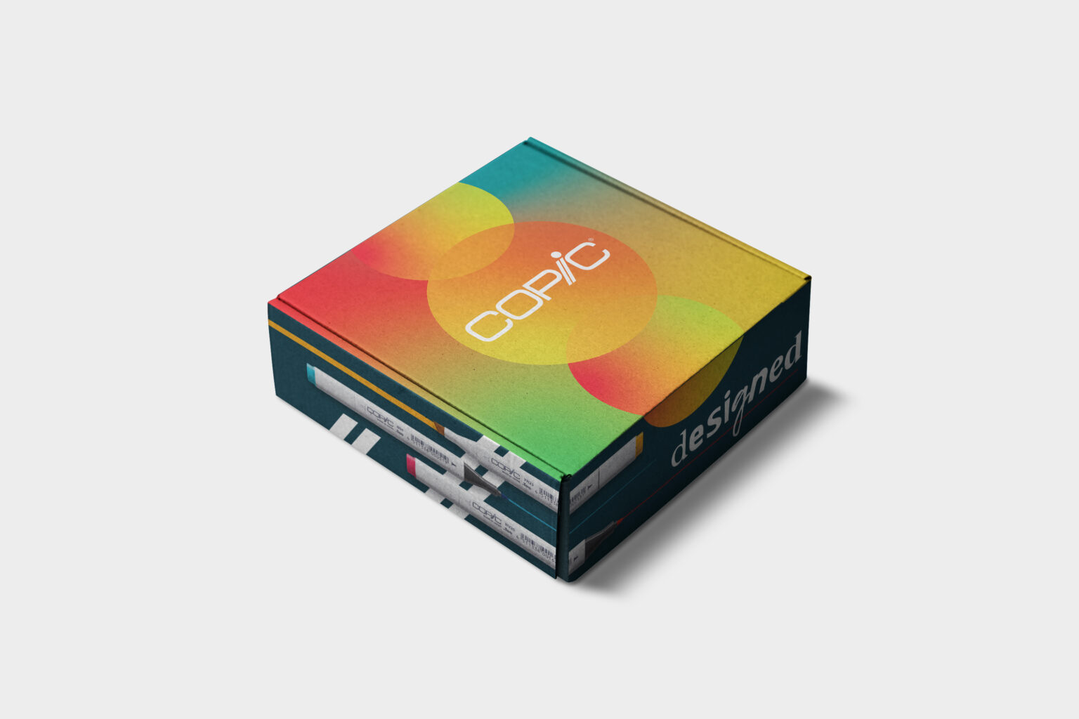
Copic is a globally recognised stationery brand, best known for its premium alcohol-based markers that have become a staple in the anime and manga art community. I collaborated with Copic on several high-impact design projects, including packaging for the launch of Copic Acrea and the widely successful $1 Copic Marker campaign. For the latter, I not only crafted promotional packaging but also developed the full campaign branding and social media assets, creating a cohesive visual identity that resonated with both loyal fans and new audiences.
The objective for the $1 Copic Marker campaign was to deliver a look that was bold, modern, and simple—yet retained Copic’s signature vibrancy and approachability. My design aimed to strike a balance between minimalism and energy, using a streamlined layout with pops of colour to capture attention across digital and physical touchpoints. For the Copic Acrea launch, the goal was to produce packaging that felt like an extension of the brand’s promotional assets—sleek, professional, and exciting to unbox—enhancing the overall customer experience from the moment of delivery.
If you are looking for professional graphic design services with a personal touch, please pop a line in the contact form or drop by my studio in Forfar.